
When it comes to making an impact on conversion rate, heatmaps are a great way of boosting your site’s potential. This article provides information on how you can use them today.
Markets are ultra-competitive these days, and businesses are having to use every tool in the book to keep up with demands from customers.
Picture this scenario: you have a site hosting many games like jewels world, but what are users doing on your site? Other than page visit metrics, wouldn’t it be great if you could track how people behave on your site? You’ll instantly get access to all sorts of information about your customer’s interests and needs. Heatmaps provide the perfect measurement to make use of behaviour data. Let’s find out more.
Table of contents
What is website heatmap?
In the digital marketing world, heatmaps are visualization maps that show you how your traffic is behaving when it comes to your site. You can easily track user flow and understand where your conversions arise. The colour-coded nature of these maps indicates where exactly users are looking and clicking.
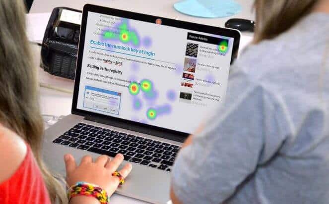
If it’s red in colour, that’s where the activity is and the opposite is transparent, although colour display choices are fully customizable. It’s an ideal tool for visually orientated people.
The need to visualise your webpage data in heatmap
With visual heat maps, you can optimize your architecture, content, and site design to target the very behaviours that lead to a higher conversion rate.
Take an example: if visitors are heading towards your sales page only by viewing your left navbar in a vertical manner then you should adjust accordingly, making changes to your right side navigation. How could you know this without a heatmap? The more easily a visitor can find what they’re looking for, the more your conversions will turbocharge.
Types of WordPress heatmaps
Link maps
Most popular in the SEO sphere, these show what links have been clicked on to a page, so when a user’s mouse hovers over a link, the heatmap changes. The best way that you can use these is to highlight insights into all the links that your page will have.
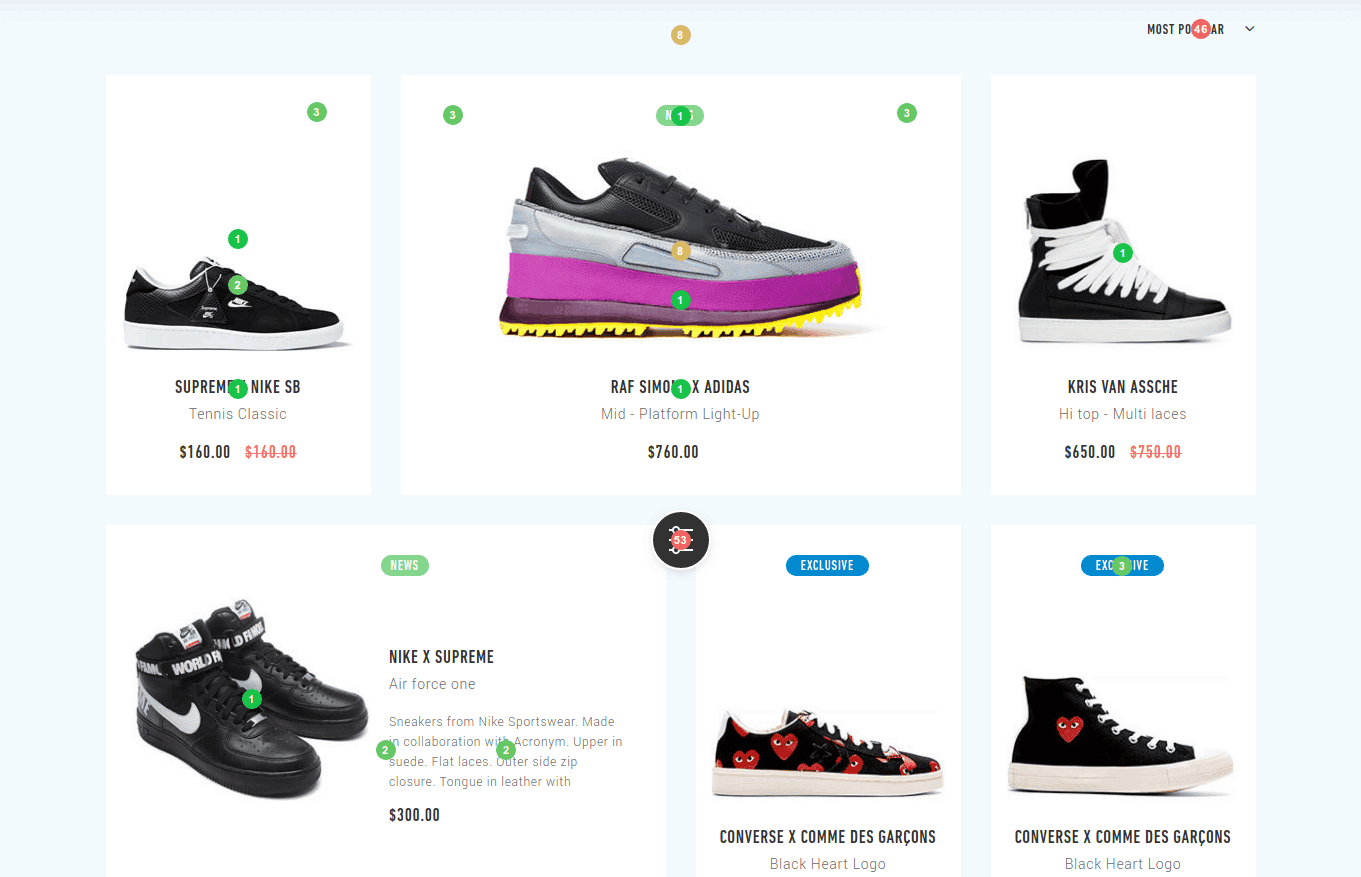
You can see which are the most clicked on links and design your site accordingly. Bad UX is a telltale sign of eCommerce site failure – if you’re running one of these sites with Shopify, tools like Lucky Orange can provide insights on links and record user sessions, helping you figure out why a visitor would abandon their cart and go elsewhere.
Click maps
This is a very simple kind of heat map that illustrates the number of times someone clicks on a particular link. As an example, picture the landing page of a WordPress website – it might have a lot of advertisements, which could redirect people to other pages where they will spend most of their time.
By monitoring the number of clicks, you can find out where to place an advertisement accordingly. If you’re running a WordPress blog, tools such as HotJar provide a number of different click maps, plus insights into how many times clicked content is shared and downloaded. High-end features in tools like Clicktale even offer an ability to “playback” user clicks, which is helpful for auditing and testing.
Scroll maps
These are a type of map that makes use of colours to depict how deep down on a page your users have scrolled to. Whenever you hover over scroll areas, you’ll be able to see what percentage of your audience has scrolled there.
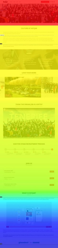
All in all, it’s a very useful tool to make sure that content isn’t too far down on a page. It can also show you if your users are unnecessarily scrolling down or up.
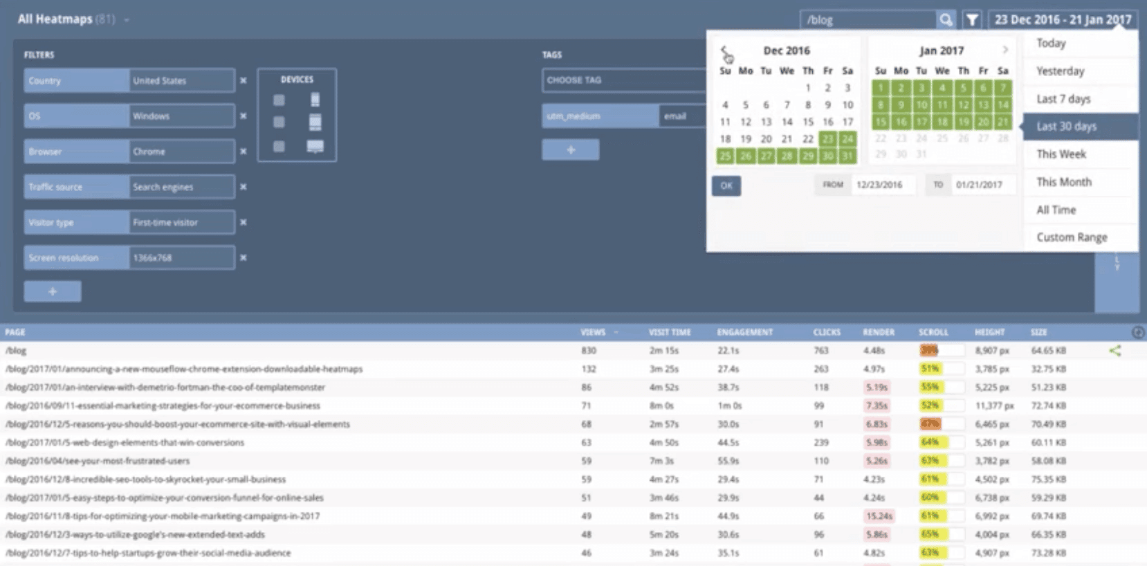
We’d recommend tools such as Mouseflow for your blog – a heatmap tool that can anonymously record all of your user’s pointer interactivity, displaying trends in easy-to-read graphics. You can even see from where in the world your users are scrolling!
Best practices when using WordPress heatmap plugins
By now you know that heat mapping can really provide you with useful insights. Just like currency conversion rate is important for a bank, marketing conversions are important for your online store’s success. So how can you use heatmap insights to boost conversions?
The benefits of colour
By looking at different colours, it’s easy to see user’s responses. We thoroughly recommend including colours within your heat map, making sure not to drown them out too much by using a wide range of tones and hues to work with. When you colour in certain areas, you can easily tell what type of users there is.
High-resolution mapping
Even if you want to use low-resolution images, you should make efforts to increase resolution. The lower your resolution, the lower the accuracy. However, high-resolution heat mapping will clearly show individual website pages and how they are linked. You can have detailed and useful insights on how to optimise conversion rates as a result of using high-resolution mapping.
Testing is very important, so test each of your images and various resolutions. There are some fantastic tools available in Shopify plugins such as VWO Insights that can use AI to predict how visitors interact with your site, enabling you to spot any UX bottlenecks and optimize accordingly.
Matching keywords to your content
There’s no one particular conversion rate formula or exact science when it comes to digital marketing, but a rule of thumb is that when people look for new information on the website, they shouldn’t need to scroll all the way to the bottom of the page. This is especially true when a user scrolls and doesn’t find what they’re looking for!
When you match content to keywords, this makes life easy for the audience. Make sure to find any related pages on your website and include links to these pages within your heat map. For effective conversion rate optimization, we’d recommend tools such as ReactFlow for Shopify, allowing you to playback scrolls and aggregate data on user scrolls based on device. Tools like ReactFlow will allow you to see where information should be placed.
See your conversion rate skyrocket
So there you have it! Heat maps are a bit like a conversion rate calculator, providing valuable ways of getting insights into conversion rates. By making use of statistics on user behaviour and tracking how they interact with your site, you can improve specific parts of your website. In the end, you’ll have much better conversions and ultimately an increase in profits for your business.
Do you know how to increase conversion rate? Share your favourite tips in the comments section below.